CoN 25th Anniversary: 1997-2022

Just bored
|
Posted: 11th August 2005 02:15
|
|
 Posts: 410 Joined: 23/5/2004 Awards:  
|
Was bored earlier and just started to sketch an original character concept, still working on it though.
Librarian? This post has been edited by Bum's Rush on 11th August 2005 02:16 -------------------- |
|
Post #93636

|
 Message
  Email
Email  Quote
Quote|
Posted: 11th August 2005 20:34
|
|
|
Posts: 1,249 Joined: 25/5/2005 Awards:
|
It's pretty nice. It has problems, though:
- The mouth should be lowered all the way down, it looks like she has a huge chin. O.O - You should clean the picture and the lines. It looks.. messy.. - Hair could use some more detail. |
|
Post #93702
|
|
Posted: 11th August 2005 20:50
|
|
|
Posts: 1,972 Joined: 31/7/2003 Awards:  
|
Her legs are in a slightly odd pose. Maybe if the front leg were bent back a little?
I like the snooty expression on her face, assuming you were going for snooty.  The other problem is the fashion disaster element, and I don't mean in the she's-a-librarian-who-doesn't-know-how-to-dress way. Those bellbottoms have to go. Try a tapered leg. Those are popular among librarians.  This post has been edited by karasuman on 11th August 2005 20:51 -------------------- Veni, vidi, dormivi. |
|
Post #93704
|
|
Posted: 12th August 2005 01:05
|
|
 Posts: 2,591 Joined: 17/1/2001 Awards:     
|
I kinda like the bellbottoms. But then, I like wearing them myself. I'm very fashion-backwards. :-)
Cute sketch. I think the position of her mouth is more to convey attitude, but I suppose it could look like she has a big chin. -------------------- I had an old signature. Now I've changed it. |
|
Post #93713
|
|
Posted: 12th August 2005 02:24
|
|
 Posts: 1,255 Joined: 27/2/2004 Awards:
|
Quote (NeoEx-Death @ 11th August 2005 15:34) - The mouth should be lowered all the way down, it looks like she has a huge chin. O.O I think it's intended to convey here attitude. I think it looks appropriate. Quote - You should clean the picture and the lines. It looks.. messy.. It's a sketch.... Dunno what's with these critics...I like it. Then again I can't draw so anything decent impresses me.  -------------------- "That Light has bestowed upon me the greatest black magic!" |
|
Post #93719
|
|
Posted: 12th August 2005 02:52
|
|
 Posts: 1,279 Joined: 6/6/2004 Awards: 
|
That's some fine work, there. I think it's one of the best I've seen from you.
I like her outfit; turtleneck sweater and bellbottoms - definitely something the librarians 'round here would wear. Then again, just about everyone - of all ages - downtown has fashion sense stuck in the 60's-70's (and I'm often an offender as well). The 'holier-than-thou' expression is fitting, too. The only (minor) problem I see is her left ankle. The top visible part needs to be angled a bit more to the right; the way it is now makes it appear as though she has one heck of a sprain, as it isn't lined up properly with the flow of that leg. Other than that it's great! -------------------- Words of Wisdom: If something can go wrong, it will. If anything simply cannot go wrong, it will anyway. If there is a possibility of several things going wrong, the one that will cause the most damage will be the one to go wrong. - Murphy’s Law Boing! Zoom! - Mr. Saturn |
|
Post #93720
|
|
Posted: 14th August 2005 11:45
|
|
 Posts: 70 Joined: 28/7/2005 Awards:
|
I do like the picture in general, the only thing that bothers me is the head. It seems too large for the body, or could just be the chin. Unless you were going for a more cartoony look where proportions wouldn't matter as much, a small change to the head would make it better. I look forward to seeing more of your work!
 |
|
Post #93807
|
|
Posted: 16th August 2005 18:04
|
|
|
Posts: 410 Joined: 23/5/2004 Awards:
|
I didn't really like the structure of the picture and I've been meaning to redraw it, but never came to it. But once again, out of boredom, I did some other sketches.
Ron Stoppable Kim Possible I couldn't sleep the other night and it was on, the rest is history. -------------------- |
|
Post #94029
|
|
Posted: 16th August 2005 18:43
|
|
|
|
Quote (Teta @ 14th August 2005 06:45) I do like the picture in general, the only thing that bothers me is the head. It seems too large for the body, or could just be the chin. Actually, the head to upper body ratio of the librarian seems okay to me. When done right, a head that's slightly too big (or at least not elmer fuddish) for the body conveys a nifty sense of petiteness (she ain't She-Hulk, either). I believe it's the waist/butt area that seems too small. I don't know...it jest bothers me for some reason. -------------------- |
|
Post #94032
|


|
Posted: 18th August 2005 09:00
|
|
|
|
Pretty nice sketches.
Upon a quick view, I only notice two problems: 1. The "librarian"'s face makes her look like a man. 2. Kim's breasts are too obvious. -------------------- Check the "What games are you playing at the moment?" thread for updates on what I've been playing. You can find me on the Fediverse! I use Mastodon, where I am @[email protected] ( https://sakurajima.moe/@glennmagusharvey ) |
|
Post #94155
|


|
Posted: 22nd August 2005 19:02
|
|
|
Posts: 410 Joined: 23/5/2004 Awards:
|
This past weekend was a doozy, boring as heck which gave me time to do some sketching.
I am, the One Winged Angel We are, Morpheus LOD!!! I lost the link to the last one, so I had to upload it from my computer. This post has been edited by Bum's Rush on 22nd August 2005 19:03 Attached Image 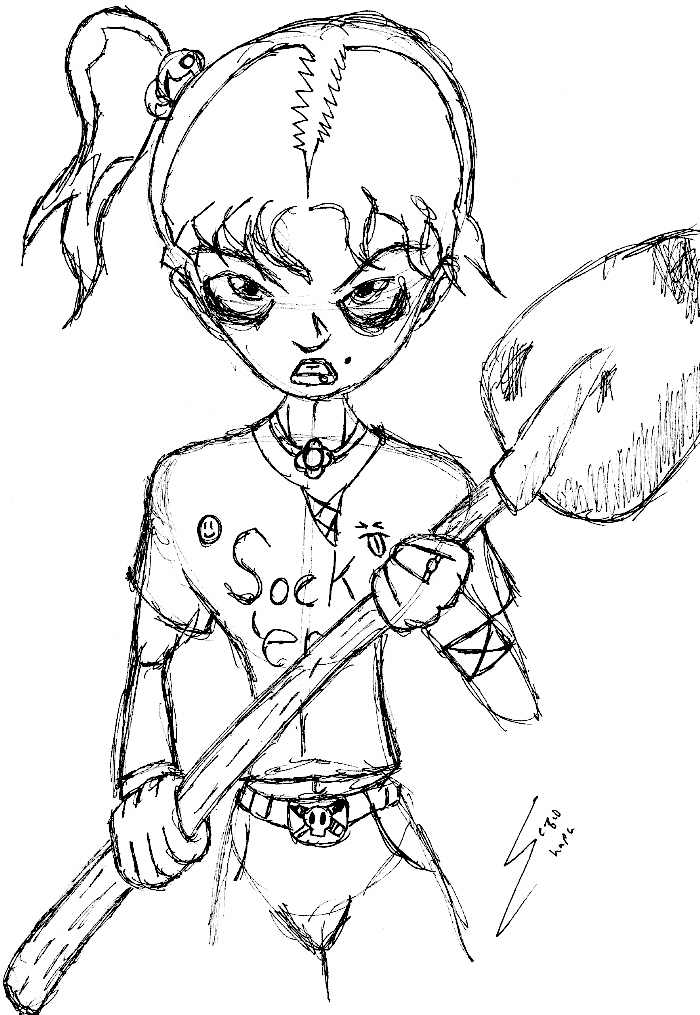 -------------------- |
|
Post #94459
|
0 User(s) are reading this topic (0 Guests and 0 Anonymous Users)
0 Members:
