CoN 25th Anniversary: 1997-2022

Sinslayer's Art Thread
|
Posted: 13th January 2007 13:21
|
|
 Posts: 112 Joined: 22/12/2006 Awards:  
|
None of which have anything to do with any FFs.
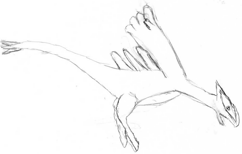 Prolly the best drawing I've ever made. I really have no skills outside of computer art. I tried digitally colouring it in, but the program crashed halfway through.  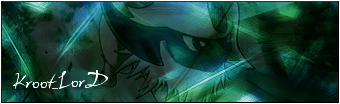  The best sigs I've made to date. Heck, I might actually try and draw something FF-related for once. I can't do faces to save my life though. Oh, and I AM goldenquagsire, FYI. Just in case any members of Psypoke happen to stumble across here. This post has been edited by Sinslayer on 24th July 2007 16:18 -------------------- |
|
Post #140968

|
 Message
  Quote
Quote|
Posted: 13th January 2007 20:56
|
|
|
|
Haha, I love the Li'l Cactus signature image. I particularly like that one and the "goldenquagsire" image. It seems you have a nice talent towards that sort of art.
-------------------- Hey, put the cellphone down for a while In the night there is something wild Can you hear it breathing? And hey, put the laptop down for a while In the night there is something wild I feel it, it's leaving me |
|
Post #141008
|
 Email
Email .png)


|
Posted: 13th January 2007 21:03
|
|
|
Posts: 112 Joined: 22/12/2006 Awards:
|
Heh, those are only my latest sigs! I used to be REALLY bad at them.
 THAT bad. IMO, the sigs don't look too bad considering I don't have Photoshop. A little project is being worked on... Wait and see if I don't go insane trying to reach the end... -------------------- |
|
Post #141009
|
|
Posted: 15th January 2007 00:30
|
|
 Posts: 1,796 Joined: 15/11/2003 Awards:
|
Personally I think the "Don't be so Prickly" sig looks the best.
The two beneath it look good, but i don't know what they are. And the Team Rocket one looks pretty good, but It's missing something, and I don't know what. -------------------- "Have you ever seen a baby do that before?" |
|
Post #141132
|
|
Posted: 15th January 2007 00:37
|
|
|
Posts: 1,249 Joined: 25/5/2005 Awards:
|
I also liked the "Don't be so Prickly" sig the best, too. Not a fan of pokemon, but when it comes to sigs you're quite talented. Team Rocket one looked good for sometihng done with MSPaint. I used to get so many pictures and cram them all into one big banner with a whole colored background and text.
|
|
Post #141133
|
|
Posted: 15th January 2007 17:00
|
|
|
Posts: 112 Joined: 22/12/2006 Awards:
|
Quote (Cloud_Strife510 @ 15th January 2007 00:30) And the Team Rocket one looks pretty good, but It's missing something, and I don't know what. I know. I was using it as an example of my early (crap) work. I tried to draw Kain last night. [FAILED] Quote ("NeoEx-Death") Team Rocket one looked good for sometihng done with MSPaint. I know it looks rough, but I actually used a different program - GIMP. Google it if you don't know what it is. -------------------- |
|
Post #141193
|
|
Posted: 15th January 2007 22:43
|
|
 Posts: 125 Joined: 22/12/2006 Awards:
|
The "don't be so prickly" sig is a little hard to read, in my opinion. Regardless, you show that you have an eye for combining colors.
And hey, if you want to learn how to draw faces, there are lots of good art tutorials online to help you. Just do a google search for it. -------------------- |
|
Post #141259
|
 Web
Web |
Posted: 16th January 2007 20:05
|
|
|
Posts: 112 Joined: 22/12/2006 Awards:
|
 An updated version of the "Kroot_Lord" sig, with glow effects on the text and higher contrast on the background. -------------------- |
|
Post #141320
|
|
Posted: 16th January 2007 20:18
|
|
|
|
The drawing's no great shakes, but hey, I can't draw either. At least you're trying.
 I used to make sigs by the dozens when I belonged to a forum to which I no longer go. I ceased to see the utility, you know? Plus, they competed on them, and I liked the competition. These are all pretty solid, nothing groundbreaking but they look just fine. The Cactus one is my favorite as well though I think the text could use some polishing so it's more legible. -------------------- "To create something great, you need the means to make a lot of really bad crap." - Kevin Kelly Why aren't you shopping AmaCoN? |
|
Post #141323
|
 Facebook
  Twitter


|
Posted: 18th January 2007 16:23
|
|
|
Posts: 112 Joined: 22/12/2006 Awards:
|
 I've discovered the Cloud function of GIMP. I'll have a new sig by the end of the night, even if I quit my French homework. Oh, and is it just me or is the Topic Reply notification not working? I only just found R51's post because I was in this forum updating the thread.. -------------------- |
|
Post #141578
|
|
Posted: 18th January 2007 16:26
|
|
 Posts: 2,336 Joined: 1/3/2004 Awards:   
|
For once, I think my own hand drawn artwork could match that of a submission here.
However, your sigs are another matter entirely. Extremely well done.  -------------------- Join the Army, see the world, meet interesting people - and kill them. ~Pacifist Badge, 1978 |
|
Post #141580
|
|
Posted: 18th January 2007 19:04
|
|
|
Posts: 112 Joined: 22/12/2006 Awards:
|
First off, I'd like to say thanks to everyone for the encouragement.
I've finally done it. My best sig to date. I've used just about every trick in the book, and here is the result:  And yet still, I find the render annoying... -------------------- |
|
Post #141591
|
|
Posted: 18th January 2007 19:12
|
|
|
Posts: 2,336 Joined: 1/3/2004 Awards:
|
It's excellent, man. Truly.
-------------------- Join the Army, see the world, meet interesting people - and kill them. ~Pacifist Badge, 1978 |
|
Post #141592
|
|
Posted: 19th January 2007 16:10
|
|
|
Posts: 112 Joined: 22/12/2006 Awards:
|
  I found a better render. And yes, I like Fullmetal Alchemist. -------------------- |
|
Post #141687
|
|
Posted: 19th January 2007 17:36
|
|
|
|
Is that what that is? You overfiltered that image quite a bit, you pretty much lost everything that was in it.
-------------------- "To create something great, you need the means to make a lot of really bad crap." - Kevin Kelly Why aren't you shopping AmaCoN? |
|
Post #141696
|
|
Posted: 19th January 2007 17:47
|
|
 Posts: 1,488 Joined: 16/3/2001 Awards:      
|
I'm gonna have to go with R51 here. You've got some skill in design and aesthetic organization, but your rendering itself is far too convoluted for me to exalt on high. I'd say the biggest trap in image editing is over-filtering.
Of course, I come from a somewhat "less is more" school of thinking. -------------------- I find your lack of faith disturbing... |
|
Post #141700
|
|
Posted: 22nd January 2007 19:07
|
|
|
Posts: 112 Joined: 22/12/2006 Awards:
|
Hm. I took your guys' opinions into mind, and I procuced this:
 OMG, something actually FF-related! -------------------- |
|
Post #142147
|
|
Posted: 22nd January 2007 20:00
|
|
|
|
Took me a good thirty seconds to realize that there was anything there but the green and red. I still don't know if it's actually FF-related, I just can't tell? I see what might be a nose...
-------------------- "To create something great, you need the means to make a lot of really bad crap." - Kevin Kelly Why aren't you shopping AmaCoN? |
|
Post #142154
|
|
Posted: 22nd January 2007 20:08
|
|
|
Posts: 112 Joined: 22/12/2006 Awards:
|
Ah. Looking at it now, I see I over-used the transparency settings.
It's Vincent Valentine, BTW. If I get a chance in-between my parents shutting off the power every five minutes, I'll remake it. I still have the background and the render. This post has been edited by Sinslayer on 22nd January 2007 20:10 -------------------- |
|
Post #142155
|
|
Posted: 22nd January 2007 20:55
|
|
|
Posts: 112 Joined: 22/12/2006 Awards:
|
Okay, I made two versions.
 and  I prefer the first one, but I'd like some opinions. -------------------- |
|
Post #142165
|
|
Posted: 23rd January 2007 23:33
|
|
|
Posts: 1,249 Joined: 25/5/2005 Awards:
|
I liked the second one better. Not really a fan of seeing Vincent's face covered in.
|
|
Post #142308
|
|
Posted: 26th January 2007 16:28
|
|
|
Posts: 112 Joined: 22/12/2006 Awards:
|
|
|
Post #142561
|

|
Posted: 26th January 2007 18:06
|
|
 Posts: 312 Joined: 25/3/2006 Awards:
|
I like it, especially how Vincent fades into the background to bring an even more mysterious part to his character. All your sigs are awesome, and cannot even give any advice because your doing nothing wrong has I see as of yet. Your drawings aren't bad, just use a little more detail and shading.
Very well done! -------------------- Acts 2:38 Then Peter said unto them, Repent, and be baptized every one of you in the name of Jesus Chrsit for the remission of sins, and ye shall receive the gift of the Holy Ghost Acts 4:12 Matthew 28:19 Go ye therefore, and teach all nations, baptizing them in the name of the Father, and of the Son, and of the Holy Ghost |
|
Post #142563
|
|
Posted: 27th January 2007 09:50
|
|
|
Posts: 112 Joined: 22/12/2006 Awards:
|
|
|
Post #142599
|

|
Posted: 27th January 2007 11:35
|
|
 Posts: 2,591 Joined: 17/1/2001 Awards:    
|
I like the black and white one that you just did. The sharpened one you did before that, not so much.
Before that, I like the greenish gold one that's under the word and, but don't like the one above it, and I really don't like the red and green one. The problem with the ones I don't like is that there's stuff blocking Vincent's face, so he's in the background. And I don't like the red and green one additionally because I just don't like that colour combo. My favourite is the black and white one. -------------------- I had an old signature. Now I've changed it. |
|
Post #142600
|
|
Posted: 27th January 2007 18:27
|
|
|
|
I agree, I think if you're adamant on using that Vincent image, the black and white one is definitely a step in the right direction. It's the nicest looking of all of them.
-------------------- Hey, put the cellphone down for a while In the night there is something wild Can you hear it breathing? And hey, put the laptop down for a while In the night there is something wild I feel it, it's leaving me |
|
Post #142615
|
|
Posted: 27th January 2007 18:48
|
|
|
Posts: 112 Joined: 22/12/2006 Awards:
|
I always find that the darker and fewer colours, the better.
Yep, I can't be bothered to find a new render. ;; Nah, my next sig will have a different piccie. -------------------- |
|
Post #142616
|
|
Posted: 30th January 2007 20:00
|
|
|
Posts: 112 Joined: 22/12/2006 Awards:
|
Mein Got, I make a lot of sigs.
 There's a version with a crappy render. If anyone wants to see it, I'll post it. -------------------- |
|
Post #142851
|
|
Posted: 4th February 2007 18:18
|
|
|
Posts: 112 Joined: 22/12/2006 Awards:
|
|
|
Post #143244
|


|
Posted: 18th February 2007 12:36
|
|
|
Posts: 112 Joined: 22/12/2006 Awards:
|
|
|
Post #144463
|

1 User(s) are reading this topic (1 Guests and 0 Anonymous Users)
0 Members:
